
UX CASE STUDY
Insider Video
Project
48-Hour Design Challenge
Company: Insider Video is the video content hub for Insider Inc., an online media company best known for financial and business news publications (e.g. Business Insider).
Role: UX Designer (worked independently)
I conducted comparative analysis of layouts, user flows, advertising placements, and a feature analysis of the video player itself. From there, I designed two layouts for the home and series pages, a smooth user flow with effective ad placement, and a logo concept based on the recent brand refresh.
Type: Website / Desktop
Summary
Challenge: Insider Inc. currently presents videos on two platforms — their own website and YouTube. The company is interested in elevating this aspect of its digital presence, and asked me to focus on improving the layouts and experience for a single video series (e.g. Insider Food). What made this particularly challenging was the 48-hour timeframe and the nature of starting from scratch. Insider Inc. hadn’t conducted any research themselves, including personas and business goals, so I had to make assumptions in areas that I would typically validate during discovery.
Solution: Within 48-hours I strategically aligned page layouts to successful industry-standard video-platform examples from my comparative analysis (of 5 competitors). My layouts established a visual hierarchy and more effective ad placement, and made the site easier to navigate overall.
Impact: My initial hypothesis (which couldn’t be tested within 48-hours) is that the visual hierarchy of the hub page would draw users into specific content — enticing clicks into series pages that would lead users to watch more episodes / related content.

Process
01 Comparative Analysis
02 Feature Analysis: Video Player
03 Design Development
01 Comparative Analysis
Methodology
Comparative Analysis
Layout
Ad Placement
User Flows
Insights & Artifacts
I analyzed video platforms of 5 competitors:
Wall Street Journal
New York Times
NPR
Huff Post
Buzzfeed
Layout: The analysis of competitor layouts indicate that a simple grid is standard for video platforms.
Ad Placement: Two patterns emerged — hiding ads within the content grid, and setting them apart in columns or rows of their own. New York Times seems most effective, drawing attention to the ad by visually setting it apart in its own row (via contrasting background color) without interrupting the user experience.
User Flows: Flows are straightforward because the video player remains at the top of the page in all 5 competitor instances.
Insider Video is currently misaligned from competitor platforms. Hub page layout doesn’t utilize the grid. Ad placement is both mixed into content rows and the right column. Video player does not exist at the top of the hub page, which results in more clicks for the user flow.

Layout Comparisons
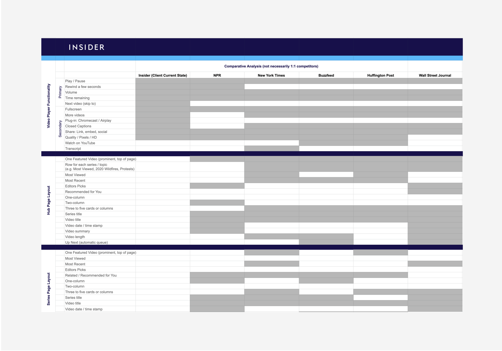
Comparative Analysis Data
02 Feature Analysis
Methodology
Comparative Analysis (continued)
Feature Analysis of the Video Player
Insights & Artifacts
I conducted a Feature Analysis of the video player functionality and found opportunities to simplify the existing set of features.
Current State: 11 Features
Proposed Design: 6
This analysis also spurred ideas for a more streamlined arrangement of UX elements.
My research also indicated that the Up Next queue of videos with the player itself is standard, which I would include in the second iteration (beyond 48-hours), bringing the total feature count to 7.
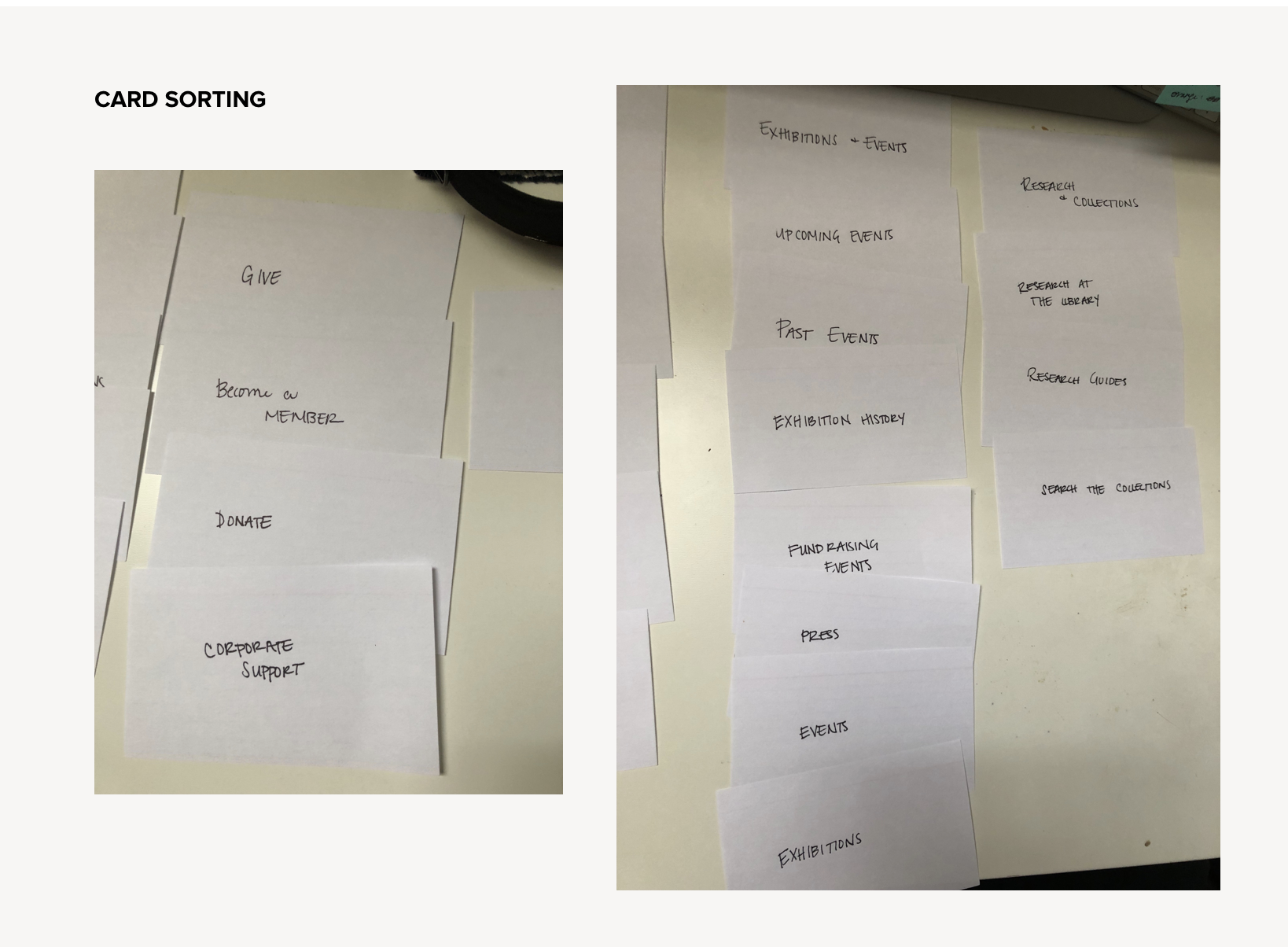
Card Sorting

Heuristics Evaluation
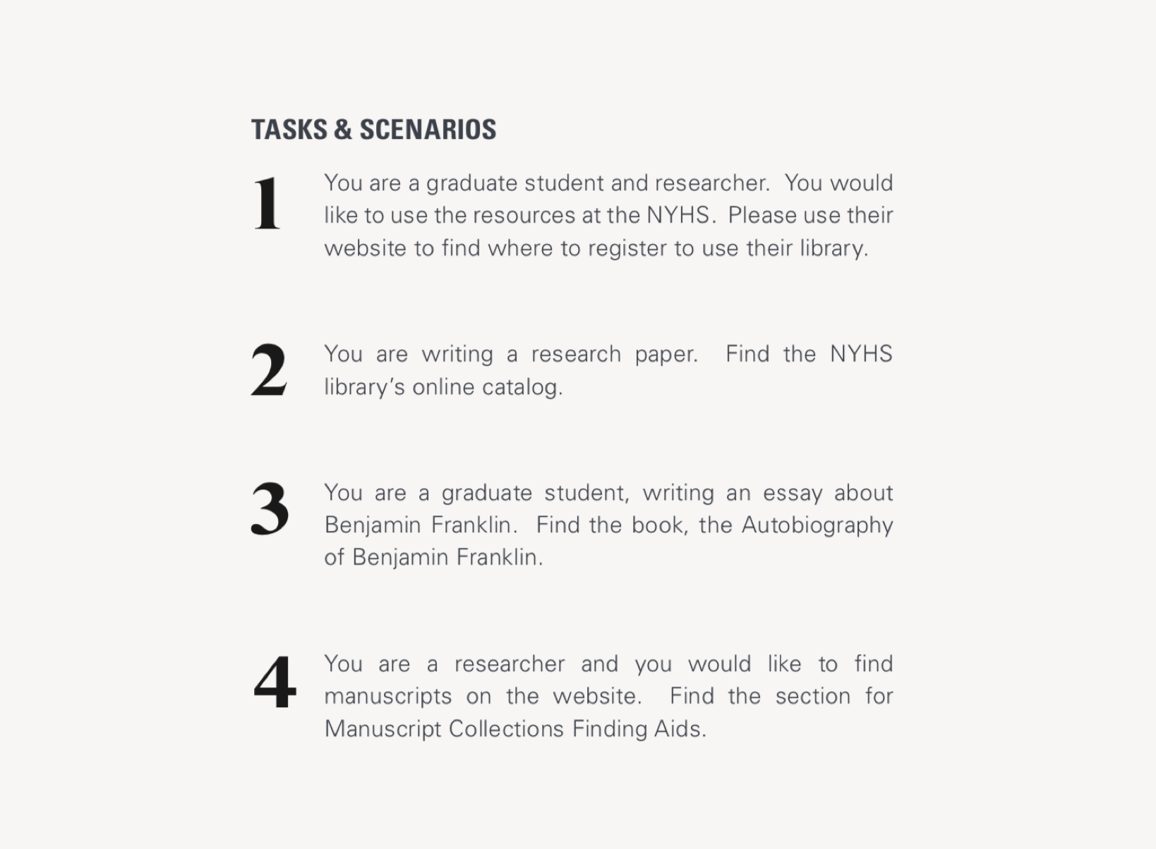
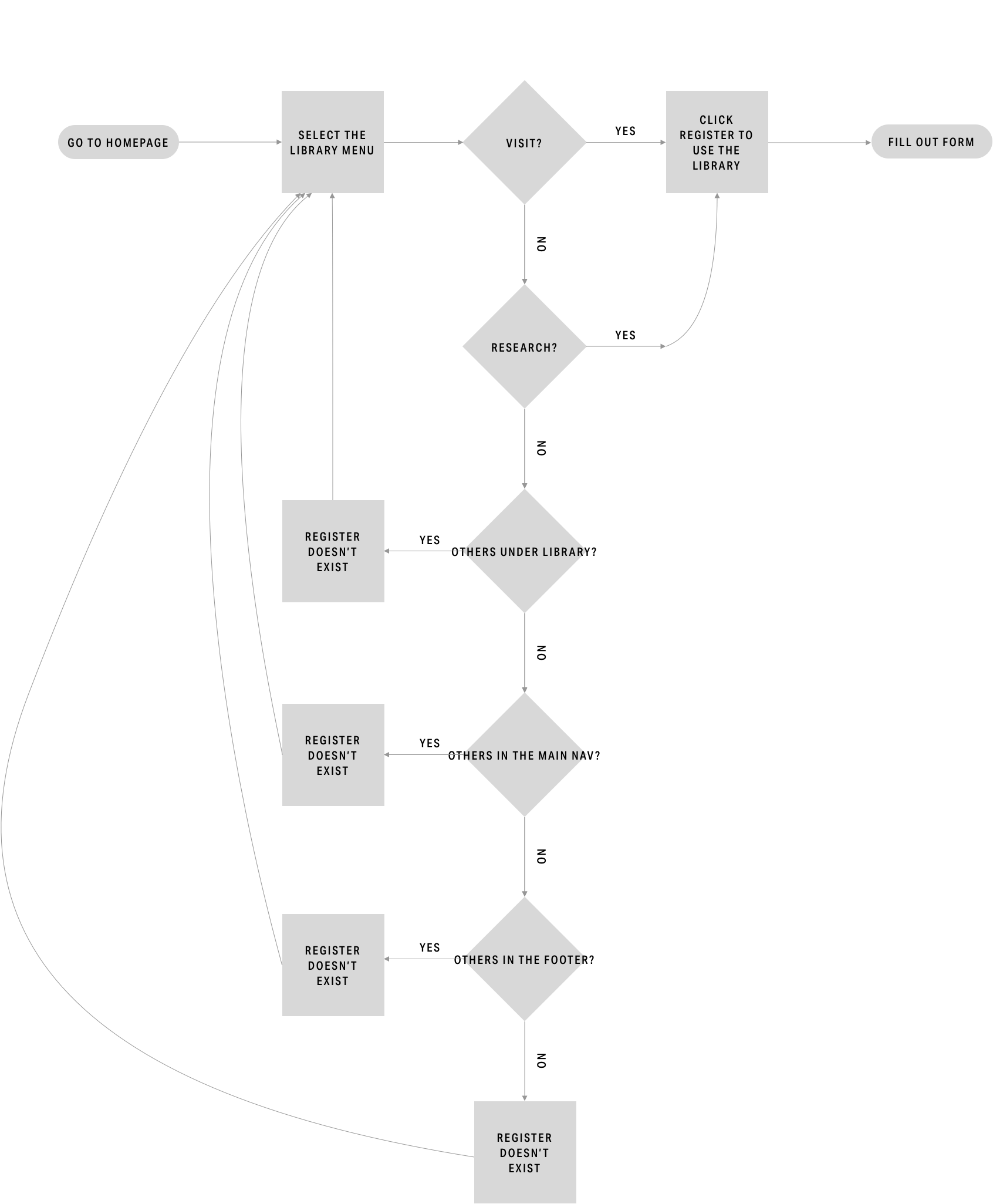
Usability Testing Tasks

Usability Testing Results
03 Design Development
Methodology
Layouts
Wireframes
Logo Design
Insights & Artifacts
There are instances where navigation labels have the same title and appear redundant. However, through site-mapping we discovered that the vast majority of those actually led to distinct pages.

Journey Map

Sitemap: Existing

Sitemap: Potential Consolidation

Sitemap: Proposed Design
Current User Flow
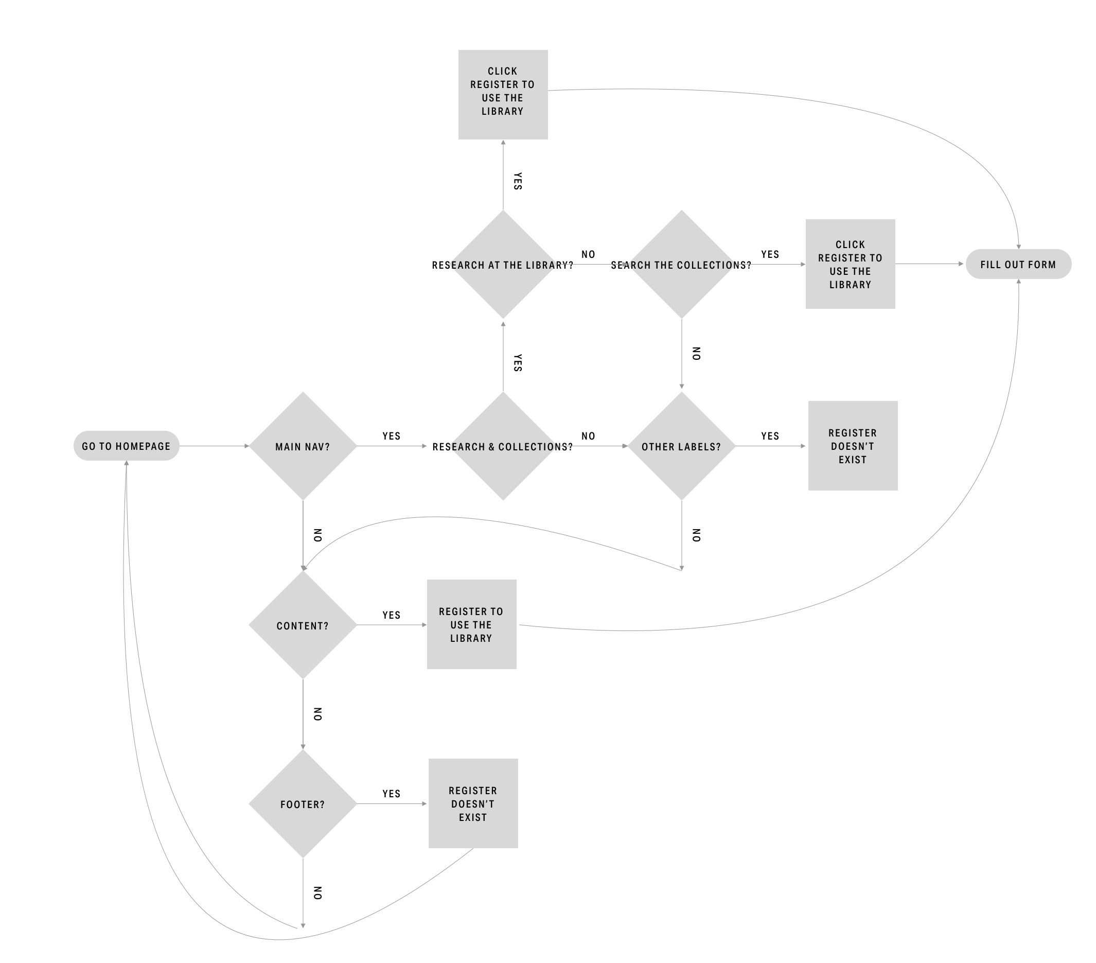
Proposed User Flow
04 Prototyping & Testing
Methodology
Design Development
Wireframes
Prototyping
Card Sorting
Usability Testing
Insights & Recommendations
Refer to the complete Current State Assessment deliverable for the full list.
Insight: Business has 3 target users
Feature: Nav Bar
Recommendation: Simplify the menu options and align the nav bar as a whole to each user type
Insight: Users feel like the pages jump around
Feature: Layout
Recommendation: Utilize a limited number of layouts
Insight: Info is split into different pages
Feature: Scroll
Recommendation: Make the new layouts scrollable

Hero

Form

Layout

Usability Testing for Proposed Design

Card Sorting for Proposed Design