
UX CASE STUDY
SharePoint Team Site
Project
Company: Fortune 500 Pharma Client had a team of 40, which partnered with 500 international organizations to track (and report on) the company’s sustainability data.
Role: UX Project Lead
I collaborated closely with the Change Consultant during discovery (user interviews, landscape assessment) and then led research, analysis, design, testing. In the end, I designed the wireframes / prototype / site guidelines and helped develop the Change Consultant’s communications plan, training materials, and launch presentation. As the Project Lead, I led all client meetings and workshops.
Team: UX Lead / Change Consultant
Type: SharePoint Team Site (desktop)
Summary
Challenge: The sustainability team came to us to help them streamline their annual reporting process. What made this project particularly challenging was the curveball of discovering that the current process was entirely manual and (even though the team had an existing site) decentralized. What began as a process project (org) quickly shifted to a product project (UX).
Solution: We overhauled the existing SharePoint site to make it more useful and delightful. By reconciling the information architecture and features, the nav bar went from 3 menus to 1 and from 14 total menu options to 7. We were also able to integrate 14 (previously) disparate tools into 1 centralized site.
Impact: As a direct result of the redesign, primary users reported spending 50% less time collecting data and 30% less effort creating the annual report.

Process
01 Discovery
02 Research
03 Analysis / Insights
04 Design
05 Training & Comms
01 Discovery
Methodology
User Interviews (24 people)
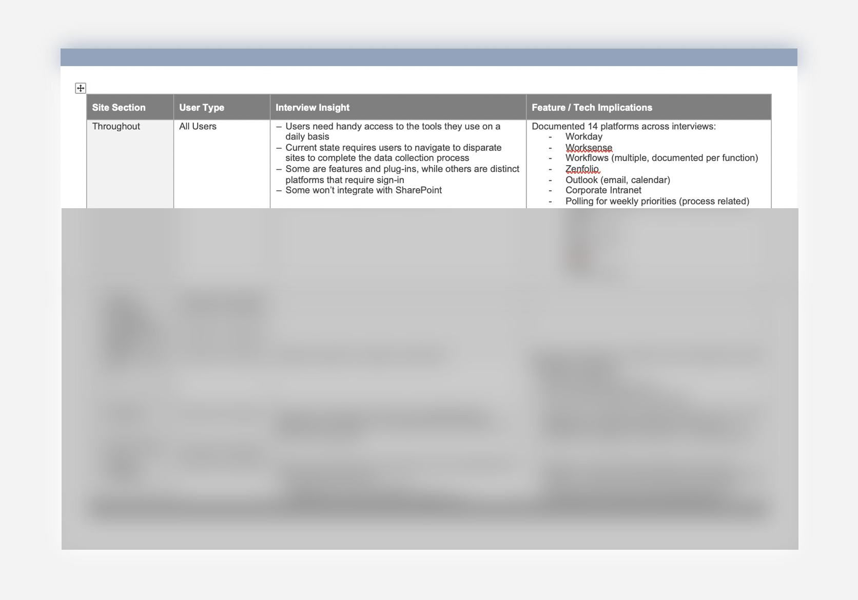
IT Landscape Assessment (14 tools)
Insights
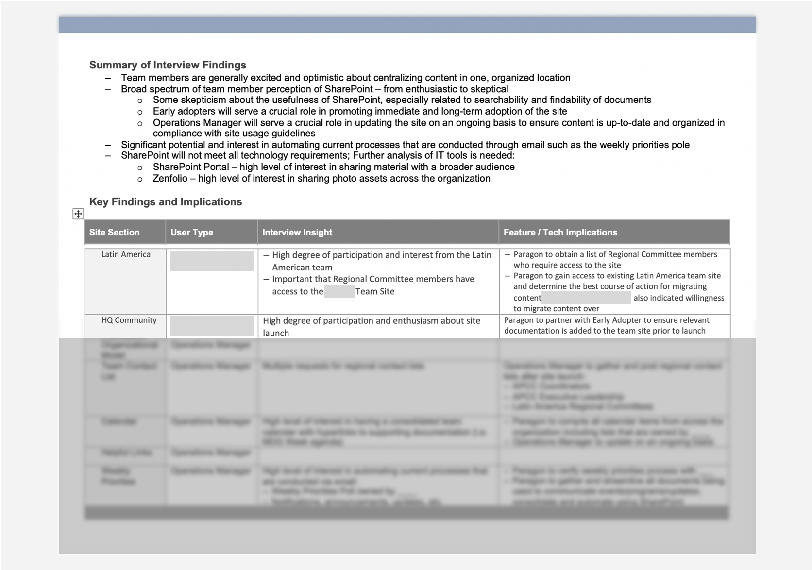
Interviews taught us the project needed to become product focused (UX). The process we were brought in to streamline was entirely manual and decentralized. Data collection occurred via email and was saved on each person’s computer in MS files (not online). We discovered potential and interest in a digital solution.
Initial Hypothesis: We could leverage the existing tech and design a formal process around it. The approach would be digital-first, so product design (UX) would guide (and fulfill requirements of) the process design.
Potential Gap: IT Landscape Assessment revealed that SharePoint would not meet all of the team’s tech requirements because of access restrictions (security) and integration capabilities (or lack thereof). We recommended a comparative analysis of platforms that could integrate better with SharePoint, which we conducted during the research phase.

Interview Insights Format: Page 1 of 6 (info redacted)

IT Landscape Documentation (redacted)

IT Landscape: Tools to integrate if possible

IT Landscape Summary
02 Research
Methodology
Information Architecture
Card Sorting (Open)
Heuristics Evaluation
Comparative Research
Insights & Artifacts
We found three distinct patterns in how users experienced the team site.
Couldn’t complete a task within the site alone
Uncertainty around navigation (3 menus)
Layout-driven confusion
Users could not move through the existing site with ease, specifically with tasks related to the data collection process. Multiple nav bars, two of which were redundant caused uncertainty at the onset of user flows. Most importantly, users could not complete tasks related to Data Collection because relevant tools either didn’t exist at all or weren’t integrated with SharePoint.
We conducted comparative research of Data Collection (and collaboration) platforms. In the end, the client decided to have us work within the company’s existing tech and then vet third-party vendors in a future phase. They agreed to eventually select a platform that could integrate with the SharePoint site we were designing.


Card Sorting: 5 Rounds Total (2 shown)


Heuristics Evaluation 1/2

Heuristics Evaluation 2/2


Redacted Summary of Platform X Demo
03 Analysis
Methodology
Sitemaps
User Flows
Layouts
Insights & Artifacts
There are instances where navigation labels have the same title and appear redundant. However, through site-mapping we discovered that the vast majority of those actually led to distinct pages.
We were able to dramatically simplify the sitemap as we moved from the existing website into redesign. The sitemap here is emblematic of the proposed redesign, but inexact. If the client decides to move forward, a thorough content audit would be required in order to accurately represent the new sitemap.
In terms of user flows, the path to register for the library is only 5 clicks. However, testing revealed that 0% of users found the direct path. For this reason, we included a User Journey to represent the sentiment of the experience.

Journey Map

Sitemap: Existing

Sitemap: Potential Consolidation

Sitemap: Proposed Design
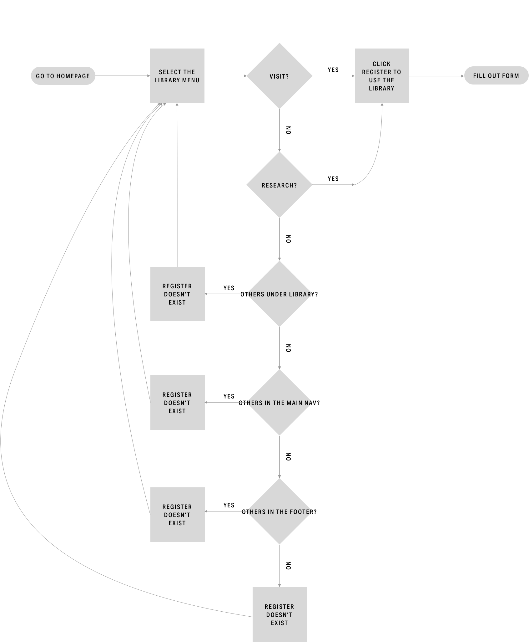
Current User Flow
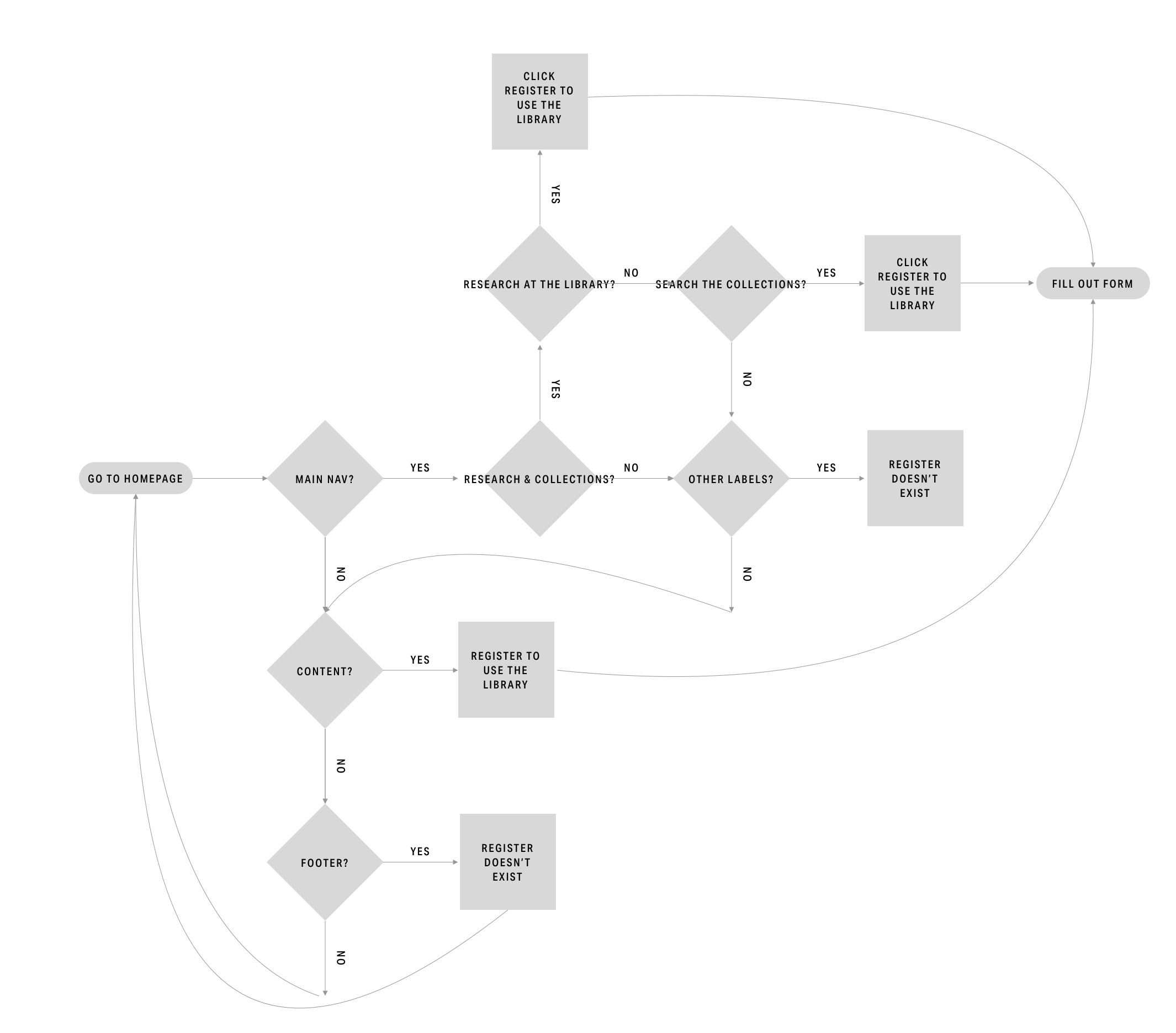
Proposed User Flow
04 Prototyping & Testing
Methodology
Design Development
Wireframes
Prototyping
Card Sorting
Usability Testing
Insights & Recommendations
Refer to the complete Current State Assessment deliverable for the full list.
Insight: Business has 3 target users
Feature: Nav Bar
Recommendation: Simplify the menu options and align the nav bar as a whole to each user type
Insight: Users feel like the pages jump around
Feature: Layout
Recommendation: Utilize a limited number of layouts
Insight: Info is split into different pages
Feature: Scroll
Recommendation: Make the new layouts scrollable

Hero

Form

Layout

Usability Testing for Proposed Design

Card Sorting for Proposed Design