
UX CASE STUDY
New-York Historical Society
Summary
Challenge: New-York Historical Society came to us to help them envision the possibilities of their digital presence. What made this project particularly challenging was that the Information Architecture possessed a high degree of complexity, which resulted in significant usability issues.
Solution: We streamlined the overall architecture of the website, which simplified user flows. By aligning the menu options with user group types, the primary nav bar went from 23 to 7 choices.
Impact: As a direct result of the redesign, the rate of successfully completing tasks went from 55% to 100% -- and the average time to complete the tasks improved by 40%.

Process
01 Discovery
02 Research
03 Research Analysis
04 Prototyping & Testing
01 Discovery
Methodology
Competitive Analysis
Competitive Matrix
Competitive Feature Analysis
Comparative Feature Analysis
Insights & Artifacts
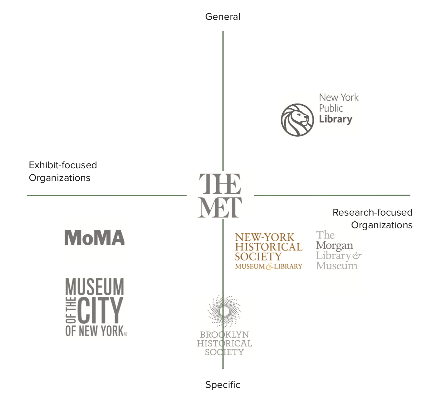
We discovered three target user groups:
Researchers & Educators
Museum-Goers
Community Members
Initial Hypothesis: Each user group would have distinct goals, thus navigation (user flow) needs.
Potential Gap: There are 3 target user groups, but the homepage has 23 menu options and 63 more in the dropdowns. When we consider an individual user group, the vast majority of the 86 (total) menu options seem impertinent.

Competitive Feature Analysis
Competitive Matrix
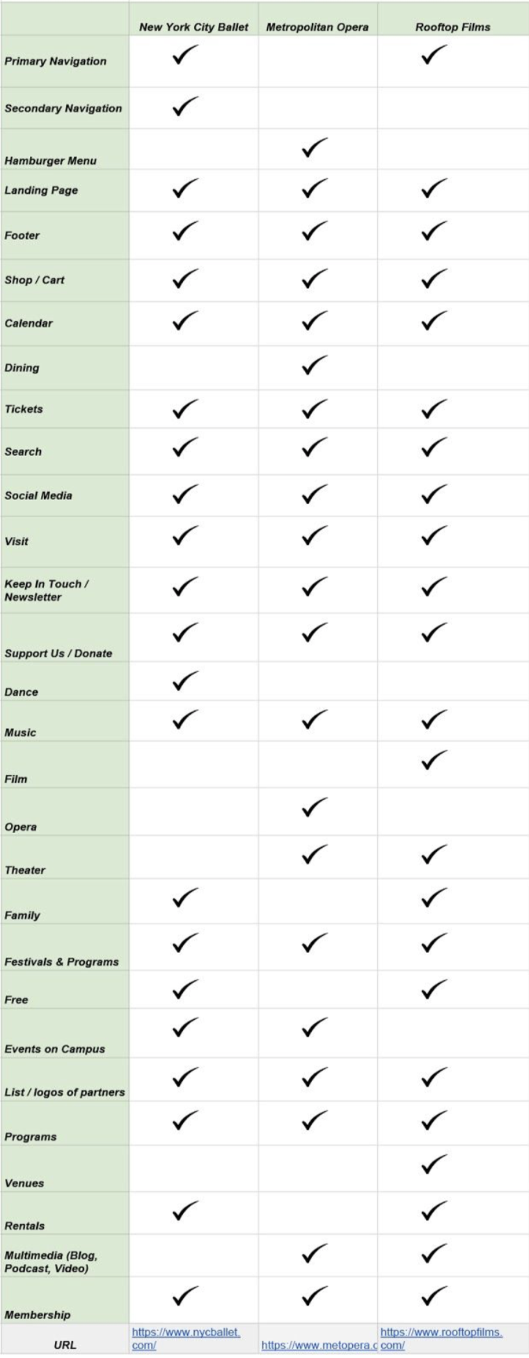
Comparative Feature Analysis
02 Research
Methodology
Usability Testing
Heuristics Evaluation
Card Sorting
Insights & Artifacts
We found three distinct patterns in how users perceived their experience with the website.
Research-specific issues
Uncertainty around language
Layout-driven confusion
Users could not move through the existing website with ease, specifically with features related to the library. The presentation of 86 menu options and text-heavy pages caused users to either fail tests outright or complete them via an indirect path with much frustration and an inability to repeat the task.
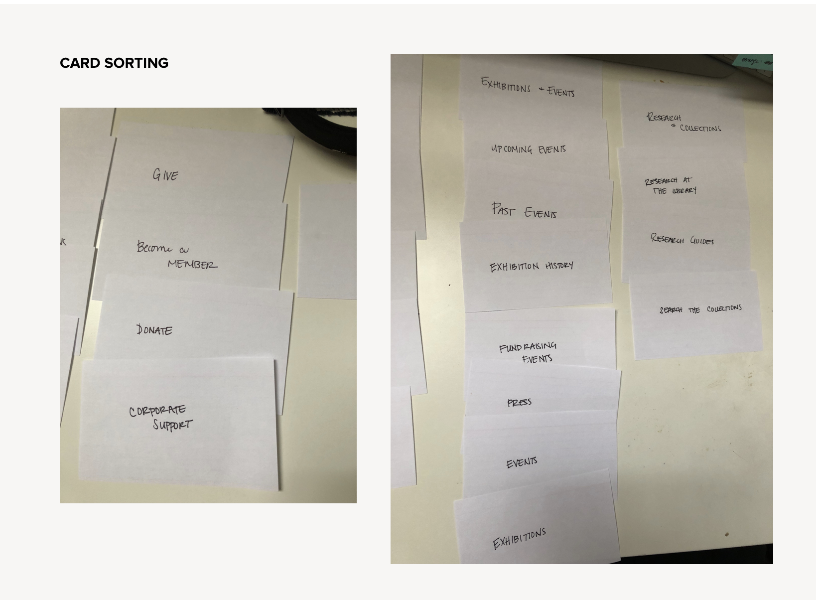
Card Sorting

Heuristics Evaluation
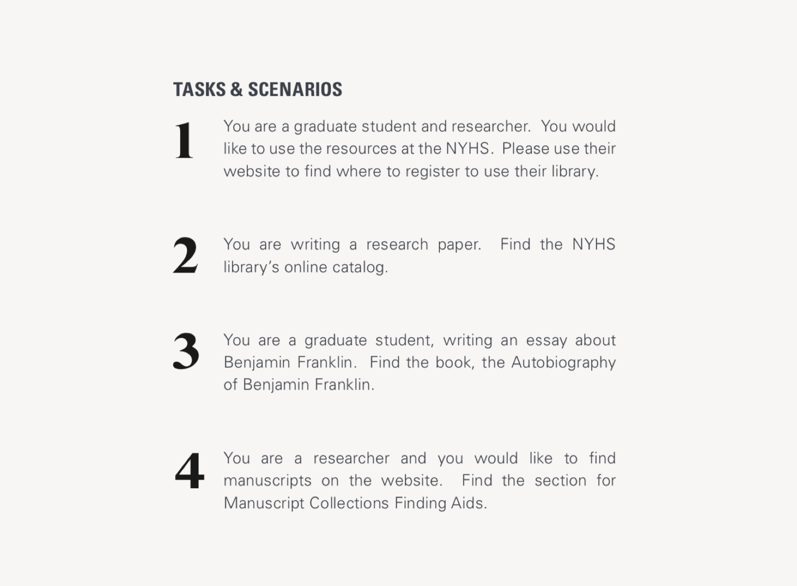
Usability Testing Tasks

Usability Testing Results
03 Analysis
Methodology
User Journey
Persona
Information Architecture
Sitemaps
User Flows
Layouts
Accessibility (mobile)
Insights & Artifacts
There are instances where navigation labels have the same title and appear redundant. However, through site-mapping we discovered that the vast majority of those actually led to distinct pages.
We were able to dramatically simplify the sitemap as we moved from the existing website into redesign. The sitemap here is emblematic of the proposed redesign, but inexact. If the client decides to move forward, a thorough content audit would be required in order to accurately represent the new sitemap.
In terms of user flows, the path to register for the library is only 5 clicks. However, testing revealed that 0% of users found the direct path. For this reason, we included a User Journey to represent the sentiment of the experience.

Journey Map

Sitemap: Existing

Sitemap: Potential Consolidation

Sitemap: Proposed Design
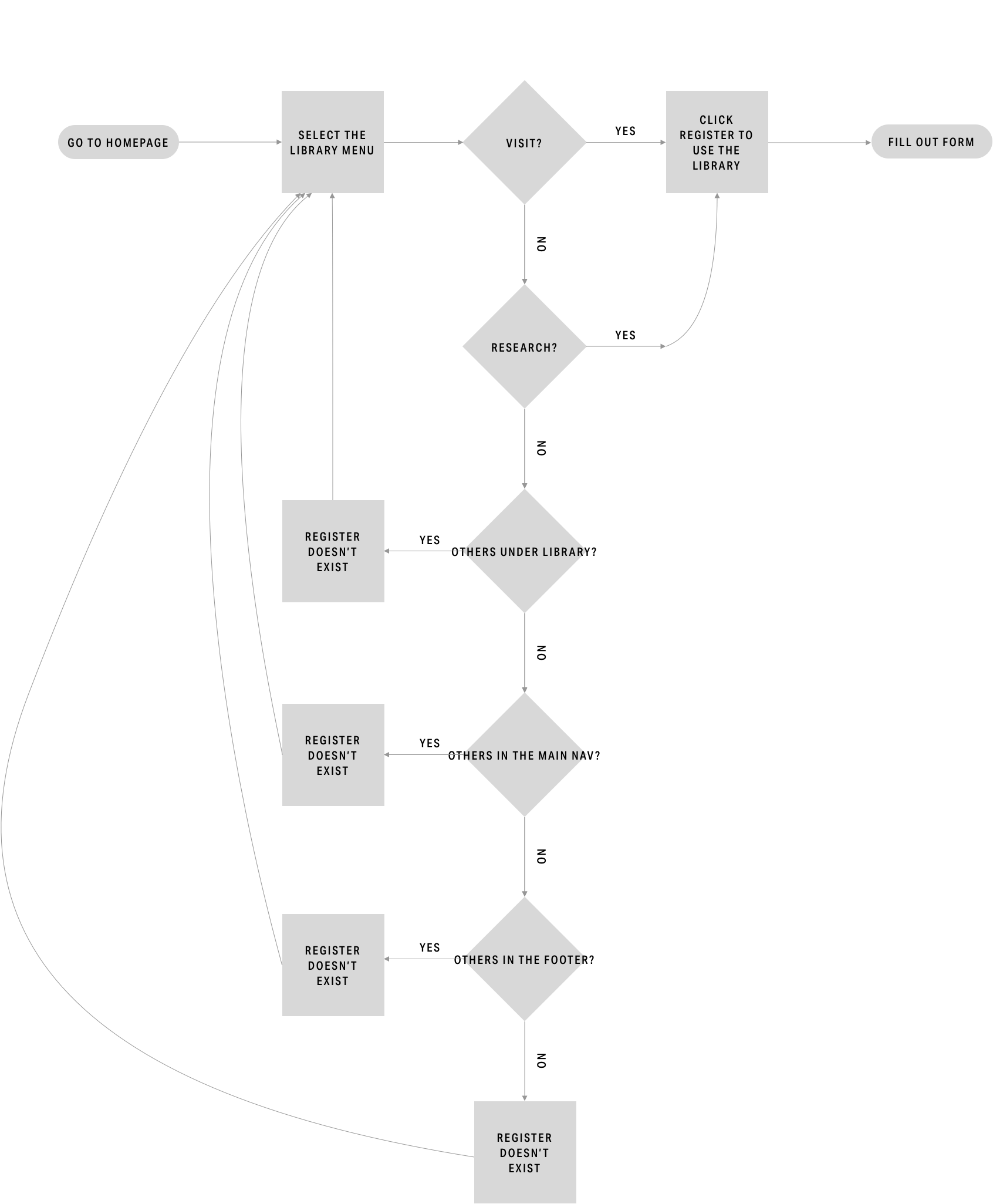
Current User Flow
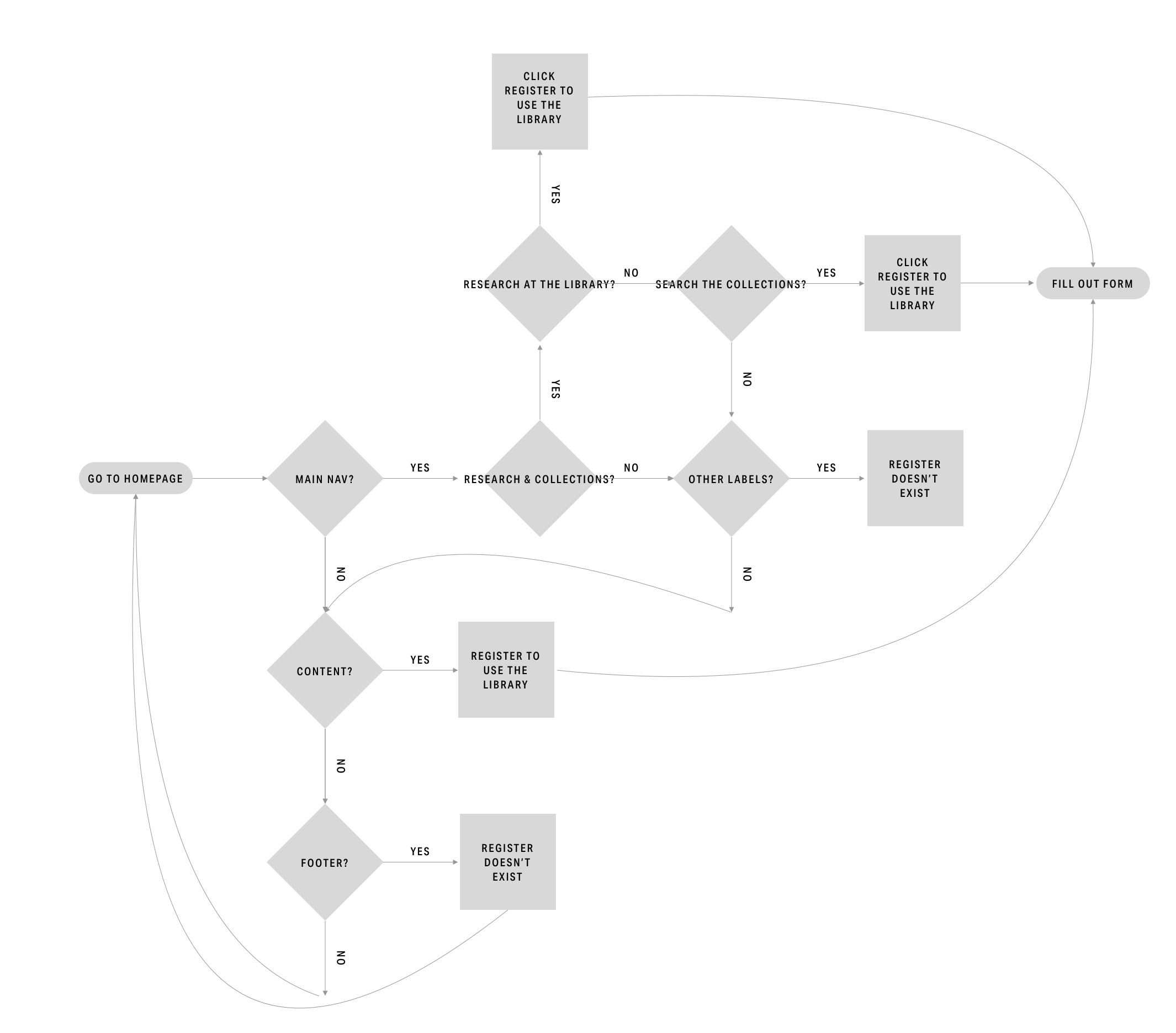
Proposed User Flow
04 Prototyping & Testing
Methodology
Design Development
Wireframes
Prototyping
Card Sorting
Usability Testing
Insights & Recommendations
Refer to the complete Current State Assessment deliverable for the full list.
Insight: Business has 3 target users
Feature: Nav Bar
Recommendation: Simplify the menu options and align the nav bar as a whole to each user type
Insight: Users feel like the pages jump around
Feature: Layout
Recommendation: Utilize a limited number of layouts
Insight: Info is split into different pages
Feature: Scroll
Recommendation: Make the new layouts scrollable

Hero

Form

Layout

Usability Testing for Proposed Design

Card Sorting for Proposed Design