
UX CASE STUDY
Insider Inc. Video
Logo & UI Style


Logo
The logo design was inspired by the use of Tiempos Text typeface on the Insider Inc. website. Bold italic — either filled or outlined — adds a playful twist. It provides versatility in terms of visual hierarchy. When Insider should maintain its status as primary, use the outlined version. In cases when video content takes the lead, emphasize it with the filled version.

UI Style
Like the logo, the look and feel of the new layout takes a cue from the freshly branded Insider Inc website. Vibrant photography sits nicely against a blurred complimentary backdrop, while the video content in the lower section stands out from the bright white canvas.
Page Layouts
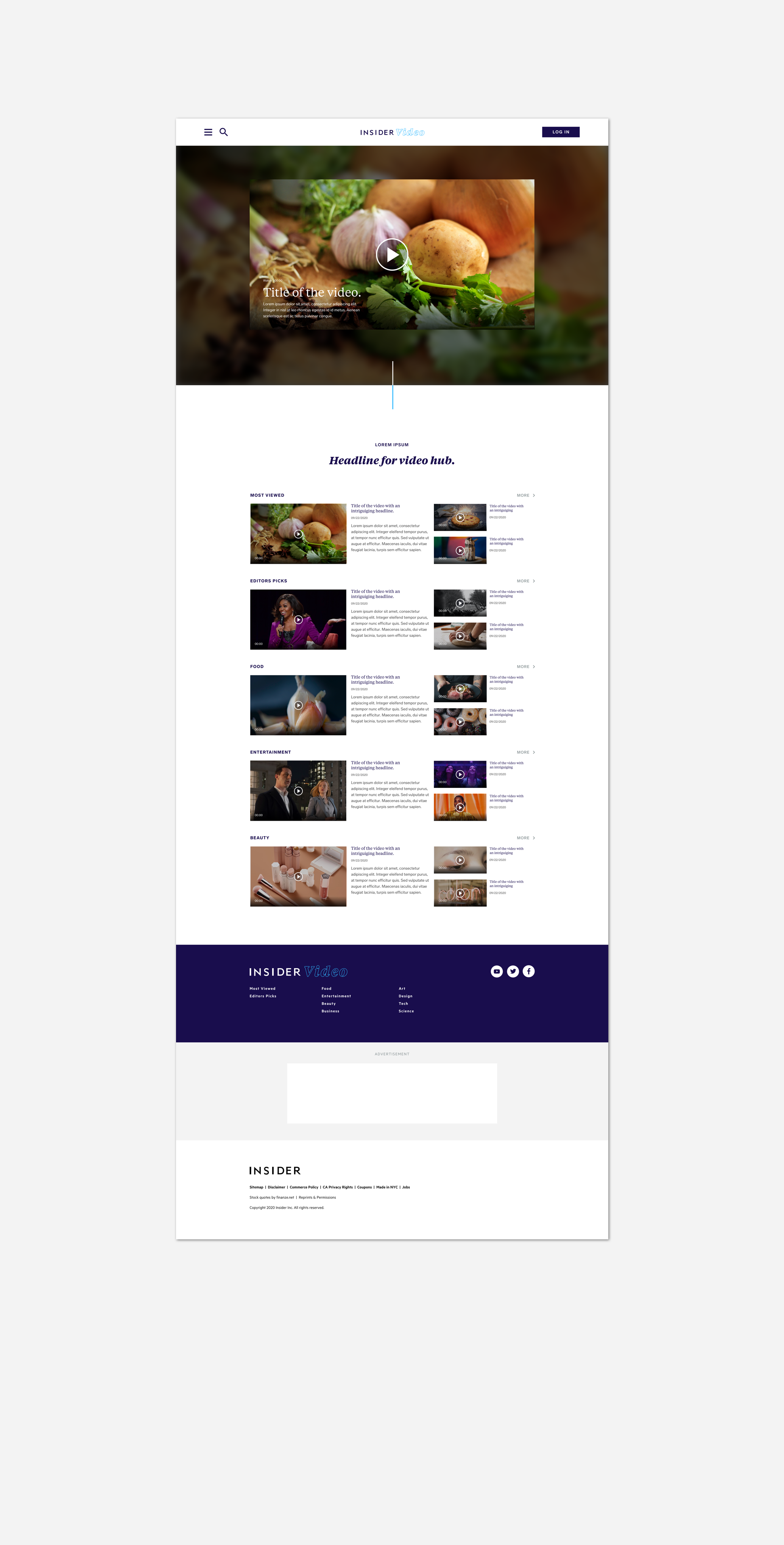
Hub Page | Grid layout with hierarchy.
With the right layout, users can easily browse the hub page where content will catch their eye and intrigue them enough to discover more. This design emphasizes one video per series (through scale) to draw users to specific episodes and entice them to click.

Series Page | Grid layout sans hierarchy.
Once users are in the series itself, all of the videos have equal visual weight. They can easily scan the images and headlines in the simple grid layout.
Advertising
100% of the companies in my comparative research plays an ad before the desired video begins. Additionally, static ads are placed throughout the page. My ad placement references that of the NYT — creating space between footers ensures that the user’s browsing experience goes uninterrupted while the ad itself garners attention because it’s set apart visually.


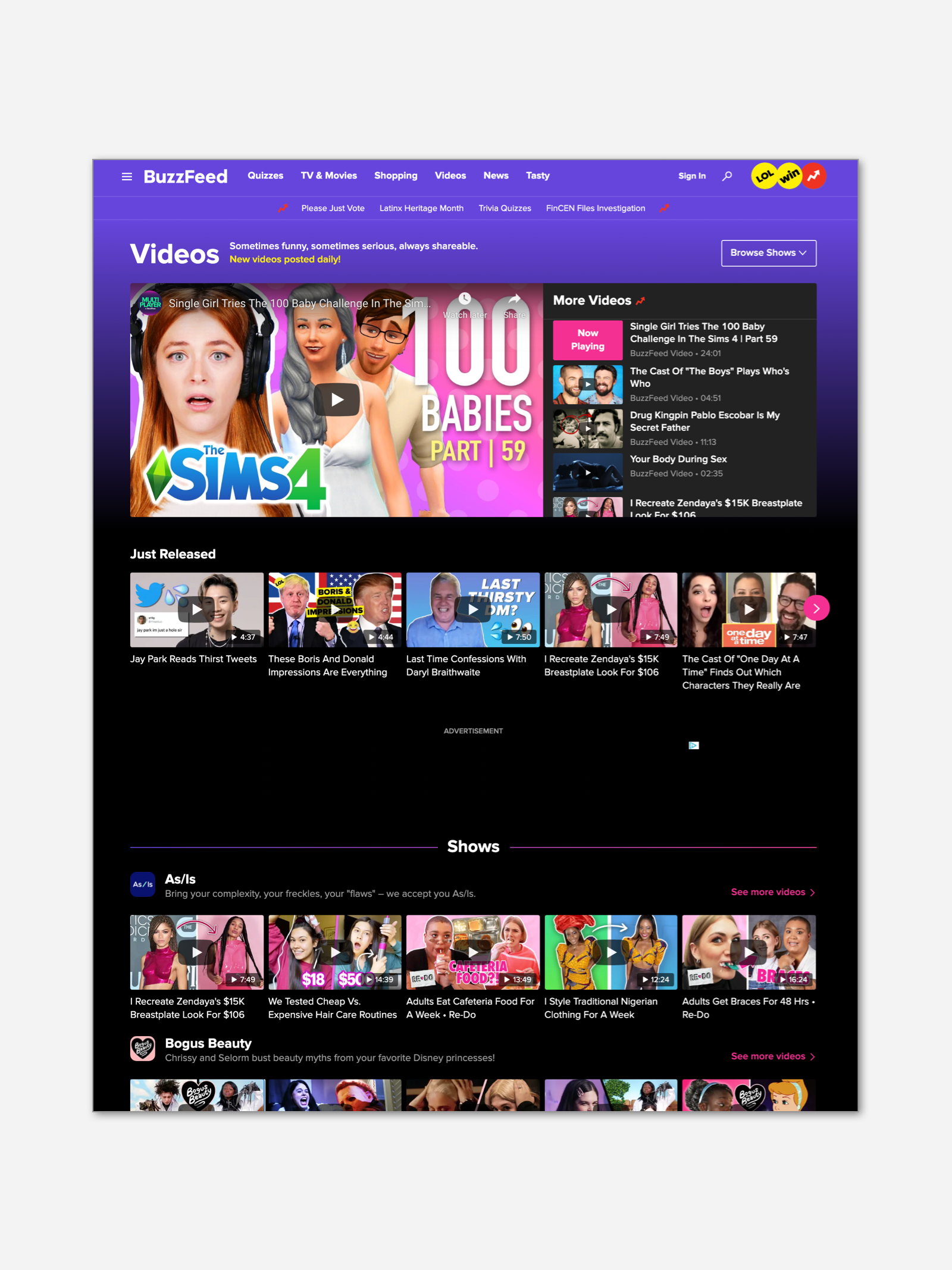
Comparative Analysis
The screenshots from the comparative analysis of layouts indicate that a simple grid is standard for video platforms. My design for the grid of the hub page (achieving hierarchy) referenced the WSJ, while the grid for the series page referenced the NYT and HuffPo.
User Flow
The prototype has many screens, but I didn’t finish adding all of the hotspots. If you have any questions about user flows, please let me know!
The primary user flow takes the user from browsing to choosing a video within a series, then playing it fullscreen. It is shown in the video below.
Feature Analysis

Comparative Analysis (again!)
In addition to comparing layouts (above) and user flows (not shown), I conducted a Feature Analysis. I focused on the video player functionality and found opportunities to simplify the existing set of features. The current state has 11 features and my design proposes 6. This analysis also spurred ideas for the more streamlined arrangement of elements.
My research indicated that the Up Next queue of videos in the player is standard and I intended to include it in my design. I would add this in R2, which would bring the total feature count to 7.