PREPARED FOR R/GA
BT | XS | XD
AGENDA | PROJECT EXAMPLES
Introduction
BT Consulting (team)
Experience (freelance)
Dear R/GA,
You “do things differently from the consulting world” as do I.
My background combines BT / XS / XD, including five years in the consulting world and ten years in human-centered design and visual design. Whether I’m creating a beautiful brand experience or developing products and services, I employ XD methodologies to create delightful, useful, human-centric solutions to business problems.
What sets me apart is that I speak both languages — BT and Experience — which means my role on project teams becomes that of a leader and translator. My presence in the room ensures that each side (creatives, strategists, clients) understands what the others expect, need, and want — and that everything comes together cohesively in the end.
Finally, I’m “not just a consultant; I’m a consultant who makes stuff.” I love conducting research and turning strategy into something that comes to life. I left consulting so I could do this more often, and after nearly three years of running my own studio I’m ready to shift my focus back to a full-time team — hopefully at R/GA.
Many thanks.
PROJECT ONE
BT Consulting
Brand Development | Product Positioning | Comms Strategy
The project team was made up of a BT Consultant (me), a designer, and two client sponsors (VP and Program Director).
Challenge
Merck approached our Business Transformation consultants to help raise awareness and engagement for its Knowledge Management (KM) Center of Excellence (CoE). The company wanted to enhance its overarching Innovation Program and saw the KM CoE as an opportune channel to do so, specifically by increasing collaboration and the flow of information -- key tenets of KM.
The project started out as a Communications Strategy and it became clear early on that we needed to expand efforts to include Brand Development, specifically positioning its products and services (value prop and naming) as well as establishing a cohesive style (visual identity).

Story
While the CoE had valuable products and services, the naming and presentation of information was inconsistent and confusing to users. I led internal efforts to sift through the content related to the client’s products and services (landscape assessment, asset inventory). Then I ran a value proposition workshop with the client to clarify and confirm how each product was distinct -- which uncovered opportunities to strategically group certain offerings and architect them as a suite. In this phase, I also worked with the designer to develop personas and conduct a competitive analysis.
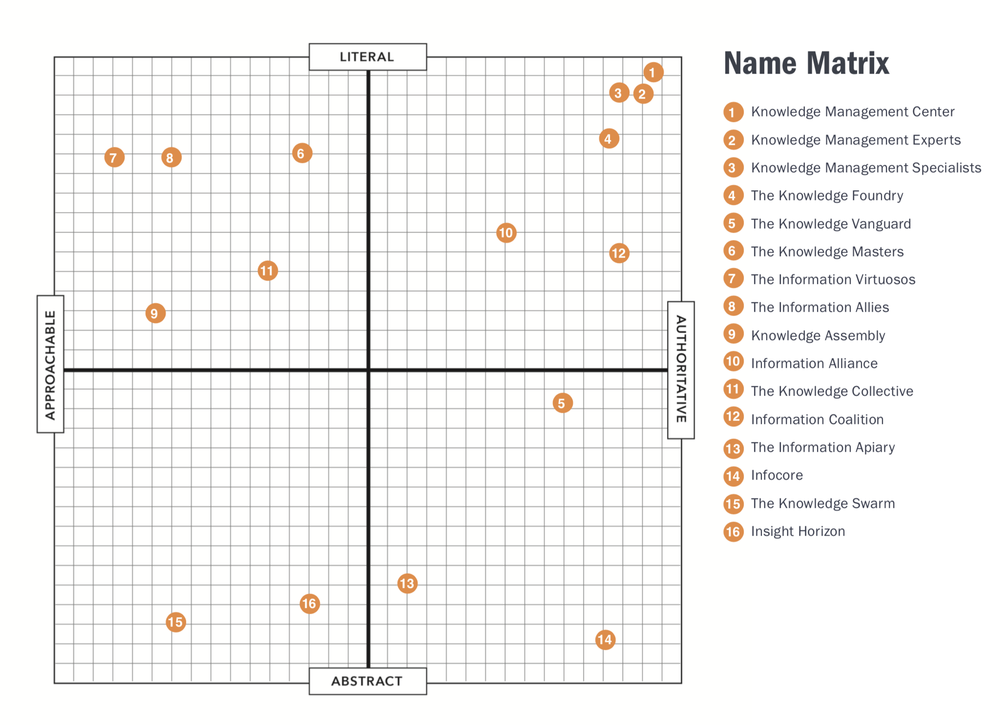
With personas, value props, and content architecture in place, we moved onto the naming exploration for the entity as a whole as well as renaming the products and services within. I ran an internal ideation session to prep (made sure the designer understood the products and services), then I led the client naming exploration workshop. In the end, we made individual product names more clear and concise and decided to keep the name of the CoE entity as is.
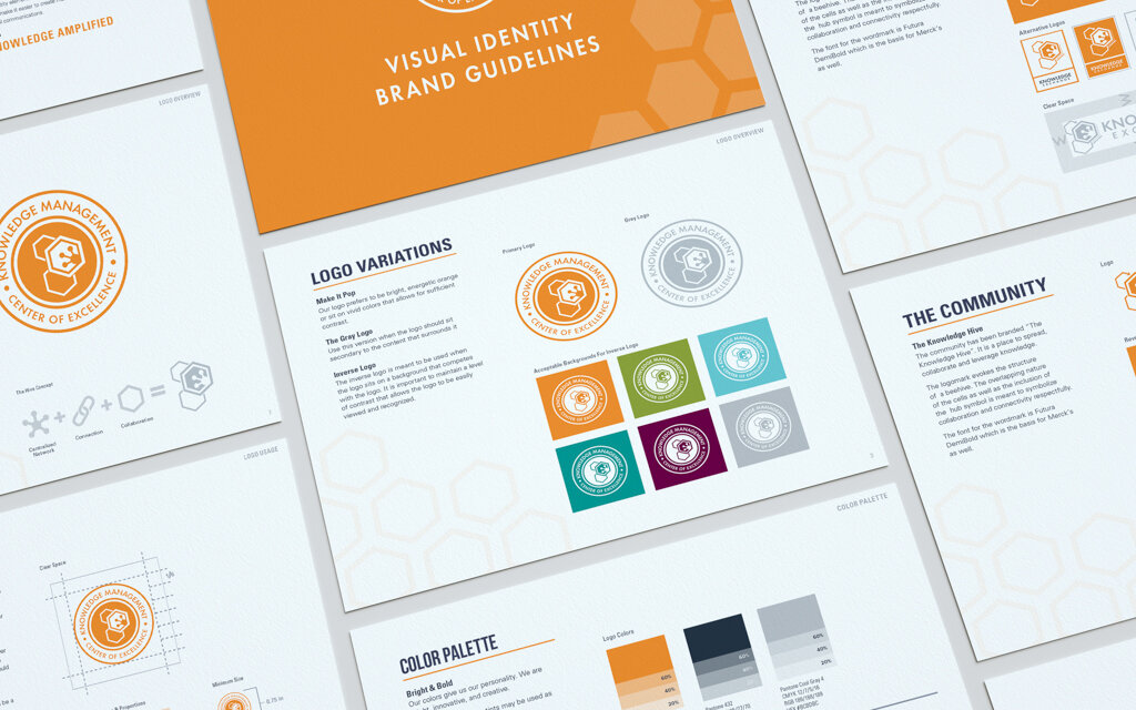
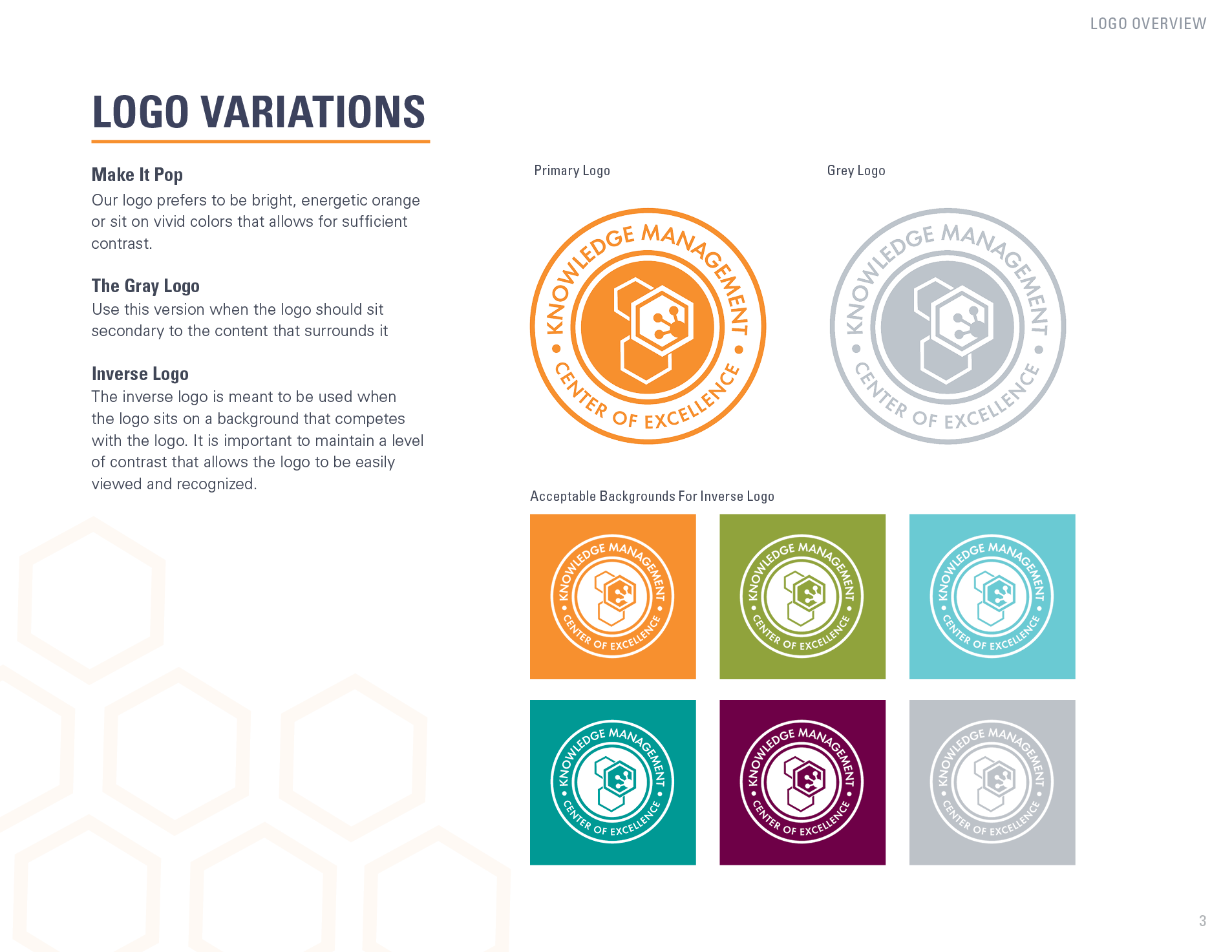
In terms of the visual identity, Merck had an extensive set of brand guidelines that it employed to create visual and verbal cohesiveness throughout all touchpoints and communications both internal and external. Though the KM CoE was an entity within Merck, the brand had no discernable visual or verbal identity or cohesiveness. We offered two initial design directions / concepts. Then we socialized and iterated on the selected concept. In the end our designer created the logo for the CoE entity, icons for each product, a style guide for the sub brand, and a visual hierarchy of the brand ecosystem.

Methodology & Deliverables
Personas
Landscape Assessment
Competitive Analysis
Content Architecture
Value Proposition
Mission & Vision Statements
Product Positioning
Naming & Tagline Exploration
Visual Identity: Logo & Style Guide
Communications Strategy
Launch Plan
01 Discovery
Insights & Artifacts
We discovered three target user groups:
Researchers & Educators
Museum-Goers
Community Members
Initial Hypothesis: Each user group would have distinct goals, thus navigation (user flow) needs.
Potential Gap: There are 3 target user groups, but the homepage has 23 menu options and 63 more in the dropdowns. When we consider an individual user group, the vast majority of the 86 (total) menu options seem impertinent.

Competitive Feature Analysis
Competitive Matrix
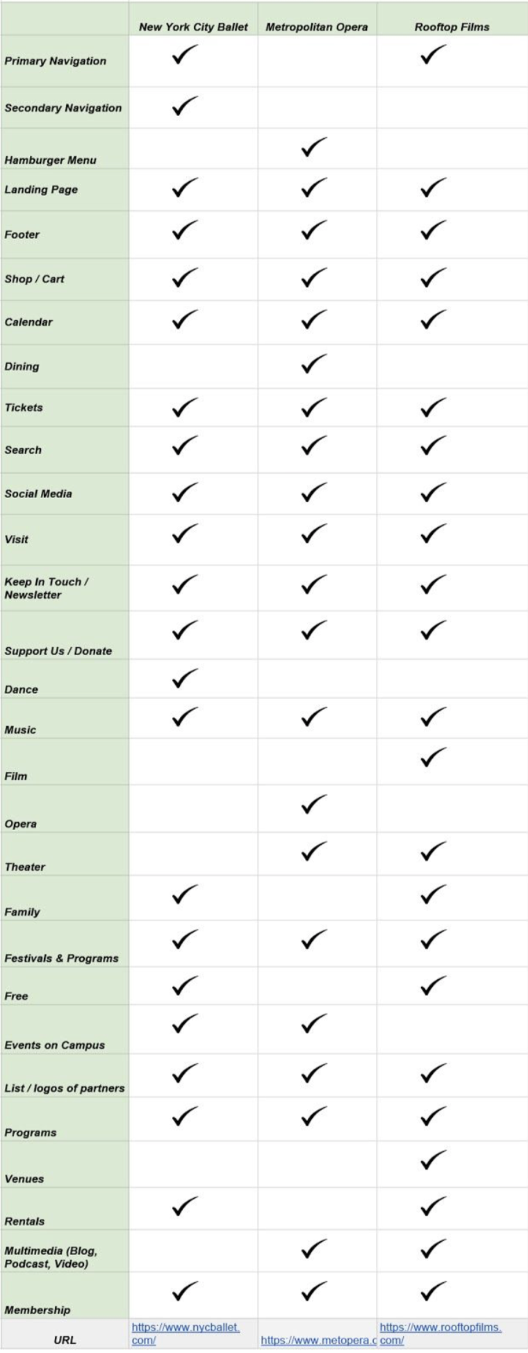
Comparative Feature Analysis
02 Research
Methodology
Usability Testing
Heuristics Evaluation
Card Sorting
Insights & Artifacts
We found three distinct patterns in how users perceived their experience with the website.
Research-specific issues
Uncertainty around language
Layout-driven confusion
Users could not move through the existing website with ease, specifically with features related to the library. The presentation of 86 menu options and text-heavy pages caused users to either fail tests outright or complete them via an indirect path with much frustration and an inability to repeat the task.
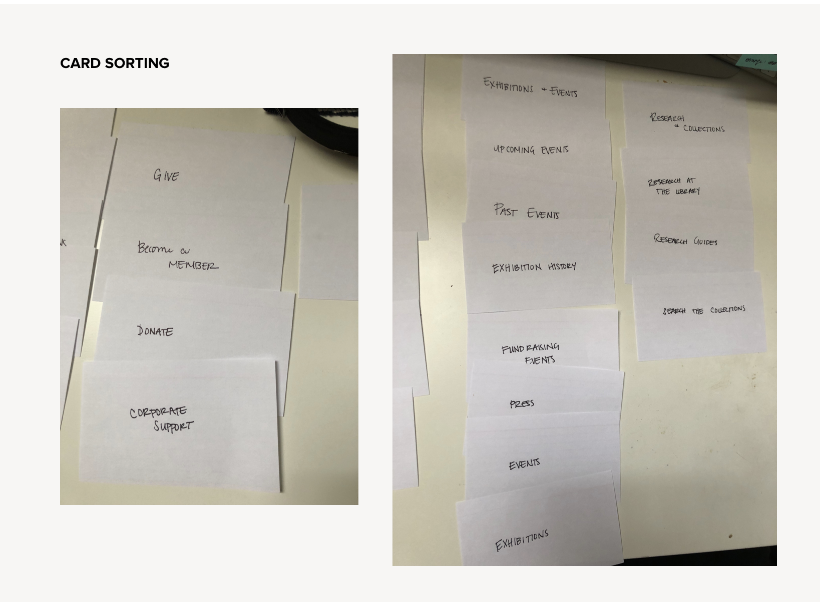
Card Sorting

Heuristics Evaluation
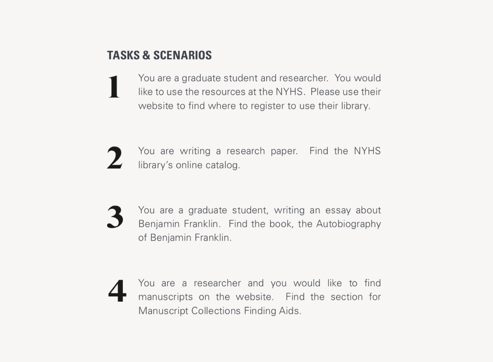
Usability Testing Tasks

Usability Testing Results
03 Analysis
Methodology
User Journey
Persona
Information Architecture
Sitemaps
User Flows
Layouts
Accessibility (mobile)
Insights & Artifacts
There are instances where navigation labels have the same title and appear redundant. However, through site-mapping we discovered that the vast majority of those actually led to distinct pages.
We were able to dramatically simplify the sitemap as we moved from the existing website into redesign. The sitemap here is emblematic of the proposed redesign, but inexact. If the client decides to move forward, a thorough content audit would be required in order to accurately represent the new sitemap.
In terms of user flows, the path to register for the library is only 5 clicks. However, testing revealed that 0% of users found the direct path. For this reason, we included a User Journey to represent the sentiment of the experience.

Journey Map

Sitemap: Existing

Sitemap: Potential Consolidation

Sitemap: Proposed Design
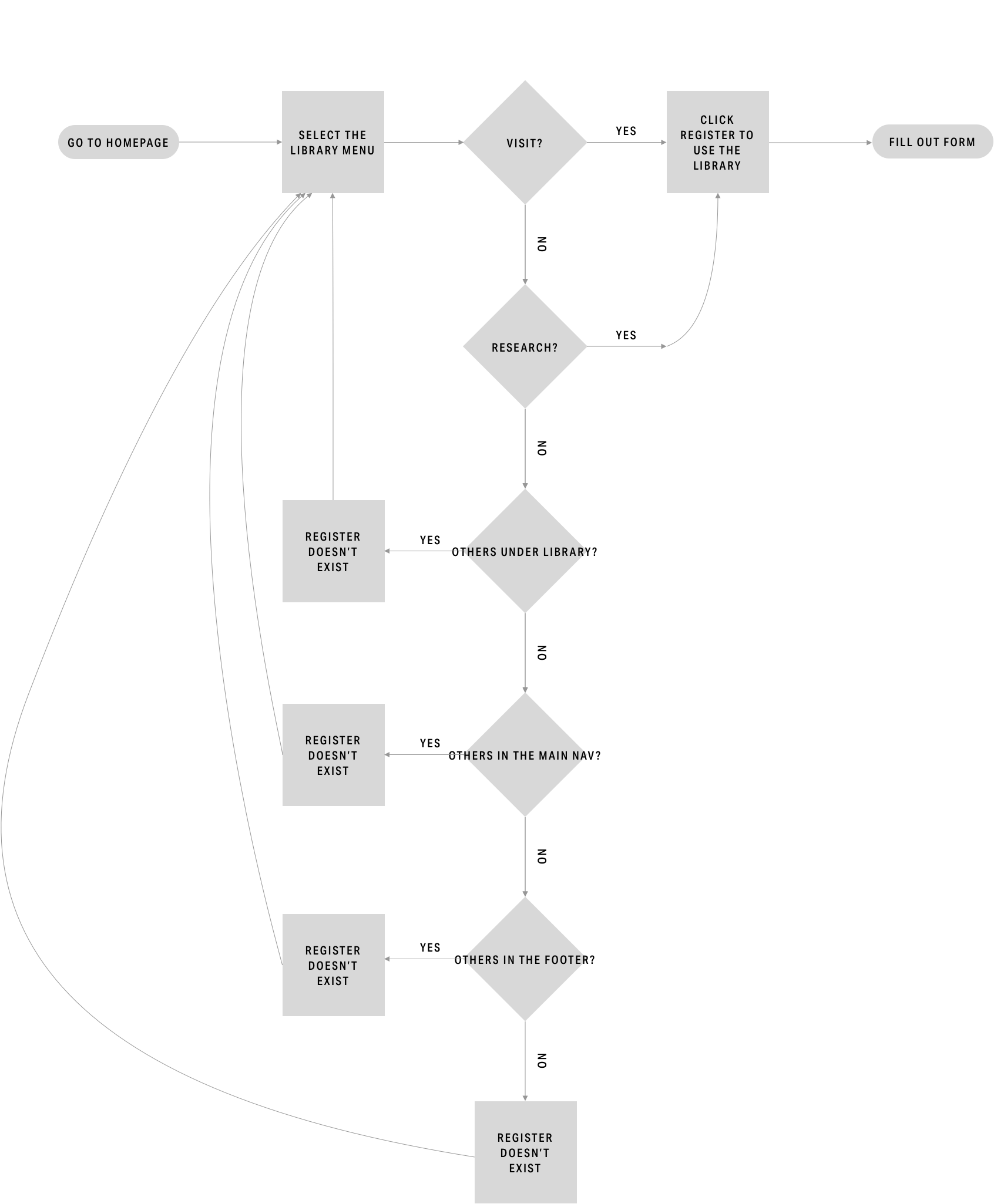
Current User Flow
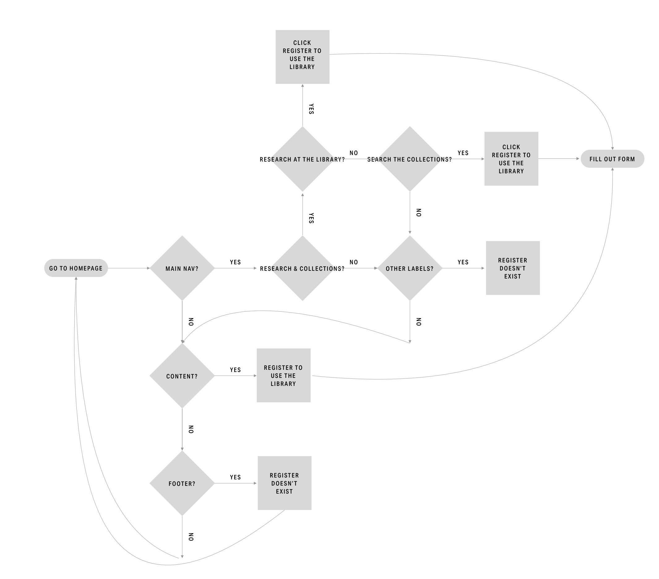
Proposed User Flow
04 Prototyping & Testing
Methodology
Design Development
Wireframes
Prototyping
Card Sorting
Usability Testing
Insights & Recommendations
Refer to the complete Current State Assessment deliverable for the full list.
Insight: Business has 3 target users
Feature: Nav Bar
Recommendation: Simplify the menu options and align the nav bar as a whole to each user type
Insight: Users feel like the pages jump around
Feature: Layout
Recommendation: Utilize a limited number of layouts
Insight: Info is split into different pages
Feature: Scroll
Recommendation: Make the new layouts scrollable

Hero

Form

Layout

Usability Testing for Proposed Design

Card Sorting for Proposed Design